
"Regression is machine learning's answer to a very human question: given what I know, how much?"
Learning Objectives
By the end of this module, you will be able to:
- Explain what regression predicts and when to use it
- Understand the "line of best fit" without heavy math
- Read a scatter plot and judge whether two things are correlated
- Tell the difference between linear and polynomial regression
- Follow a simple regression example in Scikit-learn
1. What Is Regression?
Regression answers "how much?" or "how many?" — questions with a number as the answer. How much will this house sell for? How many umbrellas will we sell if it rains? What price will pumpkins be in October?
That last one is our running example. Imagine you run a pumpkin patch and want to buy stock at the best price. You have a spreadsheet of past pumpkin sales — dates, varieties, packages, and prices. Regression lets you learn from that history to predict future prices.
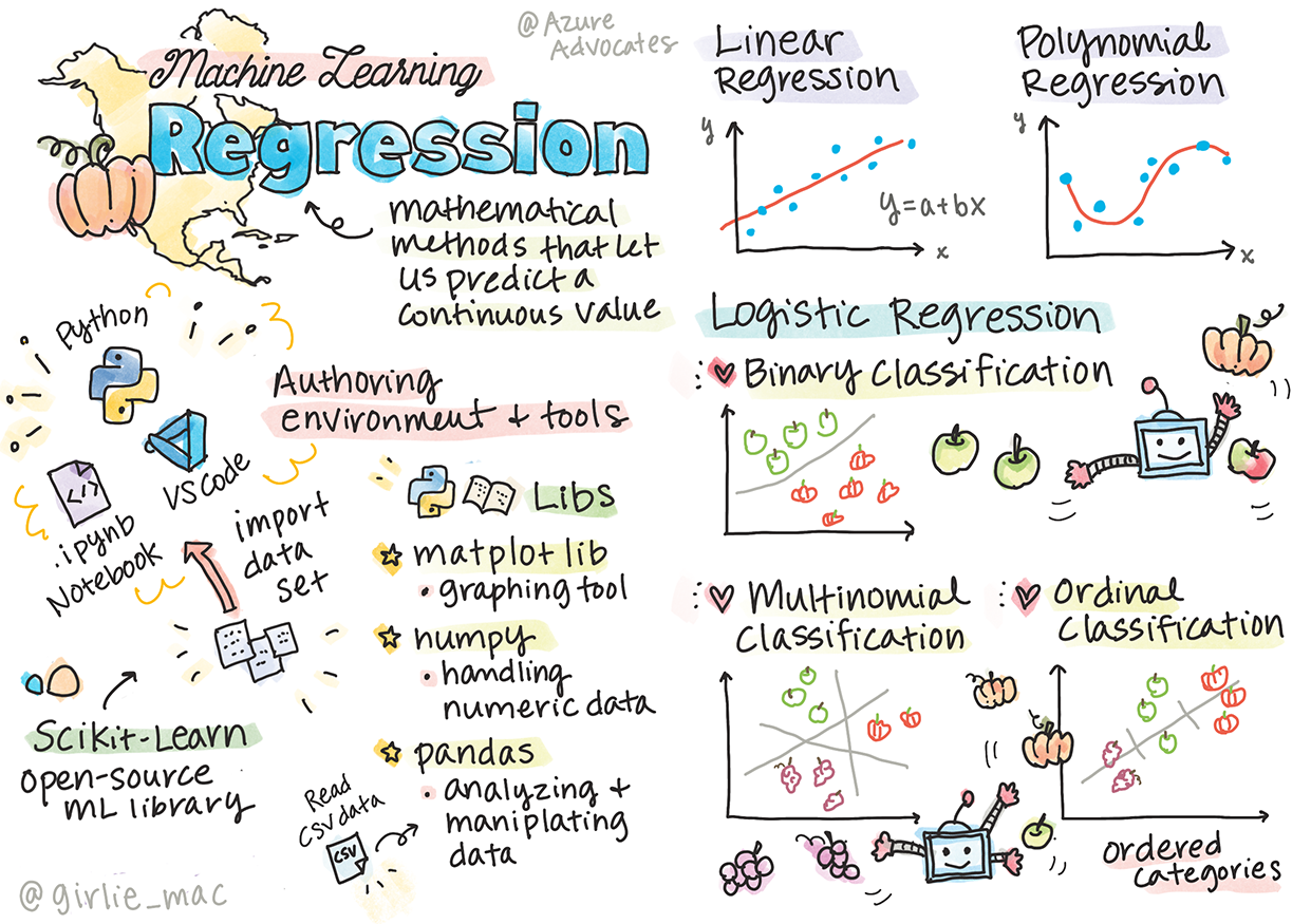
Concept: Regression predicts a continuous number (a price, a temperature, a weight) — something that can slide smoothly along a scale. This is different from predicting a category (like "orange or white"), which we'll tackle in the next module.
2. The Line of Best Fit
At its heart, simple regression draws one straight line through a cloud of data points — the line that best captures the trend.
Here's real pumpkin data, with price plotted against the day of the year:
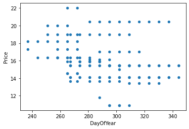
How does the computer choose the best line out of the infinite possibilities? It uses a beautifully simple idea called least squares:
- For each data point, measure how far off the line's guess is (the vertical gap is called a residual).
- Square each gap (this makes all errors positive and punishes big misses harder).
- Add them all up. The best line is the one where this total is smallest.
Concept: A simple regression line can be written as Y = a + bX. Don't let the letters scare you: X is what you know (the day), Y is what you want (the price), b is the line's steepness (slope), and a is where it starts. Training the model just means finding the best a and b.
Think of it like laying a stick across scattered dots and wiggling it until it sits as close to all of them as possible. That's least squares.
3. Correlation: Do Two Things Move Together?
Before trusting a line, we ask: are these two things even related? That's correlation, measured from -1 to 1:
| Correlation near… | Meaning | Picture |
|---|---|---|
| +1 | Strong positive — both rise together | Dots hug an upward line |
| 0 | No relationship | Dots scattered like buckshot |
| -1 | Strong negative — one rises as the other falls | Dots hug a downward line |
Here's where our pumpkin data gets interesting. When you check whether the month predicts the price, the correlation is tiny — barely -0.15. Month alone is almost useless! But when you color the dots by pumpkin variety, a hidden truth pops out: variety drives price far more than the calendar does.
Fun Fact: This is a perfect little lesson in real data science. The obvious feature (the date) turned out to be weak, and the real signal was hiding in a different column (the variety). Finding which clue actually matters is often the most valuable detective work you'll do.
4. Linear vs. Polynomial: Straight Lines and Gentle Curves
Not every trend is a straight line. Sometimes prices dip and rise in a curve. That's where polynomial regression comes in — it fits a curve instead of a straight line.
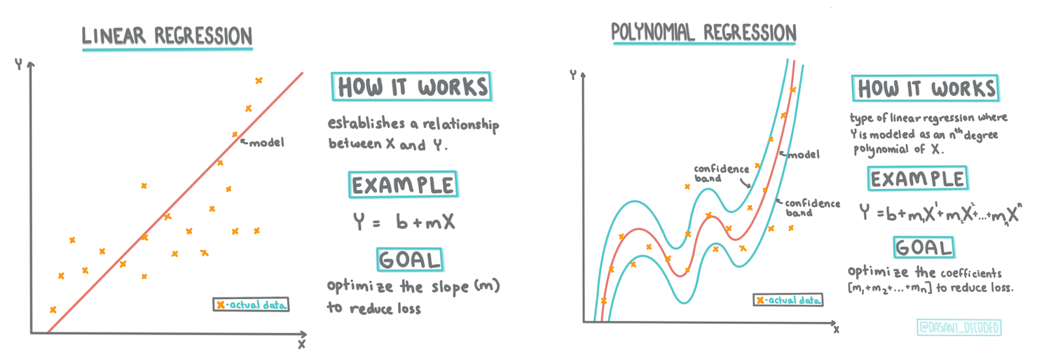
| Linear Regression | Polynomial Regression | |
|---|---|---|
| Shape | A straight line | A flexible curve |
| Best for | Steady, consistent trends | Trends that bend |
| Risk | Too simple for curvy data | Can overfit if too wiggly |
Warning: A curvy polynomial can hug your training data too perfectly — bending to chase every dot, including the noise. Remember overfitting from Module 3? A wildly wiggly curve is what it looks like. Prefer the simplest shape that captures the real trend.
5. Building One in Practice
Here's the whole idea in a few readable lines of Scikit-learn. You don't need to memorize it — just notice how it mirrors the fit / predict rhythm from Module 3:
[object Object], sklearn.linear_model ,[object Object], LinearRegression

model = LinearRegression()      ,[object Object],
model.fit(X_train, y_train)     ,[object Object],
predicted_price = model.predict(X_new)   ,[object Object],
Three lines: create, learn, predict. Whether you're forecasting pumpkin prices or house values, the shape of the code barely changes.
6. How Good Is the Model?
For regression, one common report card is the R² score ("R-squared"), a number from 0 to 1:
- Close to 1: the line explains the data well — good predictions.
- Close to 0: the line barely does better than guessing the average.
It answers, in one number, "how much of the ups and downs in price does my model actually capture?" You'll always judge a model on unseen test data, never the data it studied — the honest exam from Module 3.
Try This! Think of something in your own life you could predict with regression: your monthly phone bill vs. hours streamed, coffee sold vs. temperature, study hours vs. test scores. What's your X (the clue) and your Y (the answer)? Sketch the scatter plot you'd expect — is it a tight line or a scattered cloud?
Key Takeaway: Regression predicts numbers by fitting the "line of best fit" through data using least squares. Correlation tells you whether two things move together, linear regression draws a straight line while polynomial fits a curve (beware over-wiggling), and in code it's the familiar fit then predict. The R² score tells you how well the line captures the real trend.
This module is adapted from Microsoft's open-source ML-For-Beginners curriculum (MIT License). Regression sketchnote by Tomomi Imura (CC BY-SA 4.0); linear/polynomial infographic by Dasani Madipalli.