
"An insight nobody understands changes nothing. Communication is how analysis becomes action."
Learning Objectives
By the end of this module, you will be able to:
- Explain why communication is a core data skill
- Structure a data story
- Tailor your message to the audience
1. The Overlooked Superpower
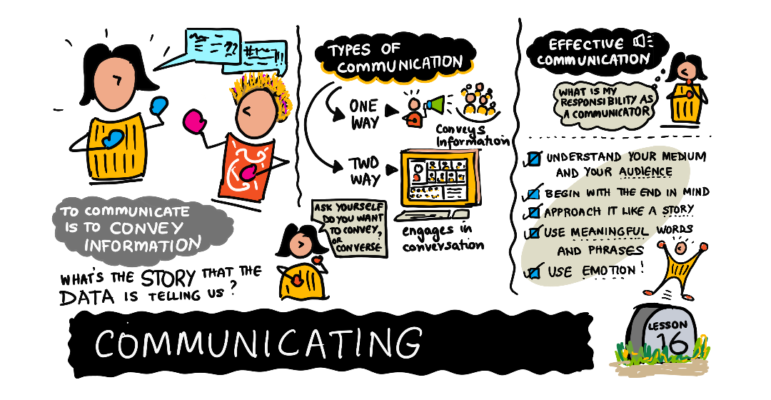
You can do brilliant analysis, but if you can't explain it clearly, it won't influence any decision. Data storytelling turns findings into a message people act on. Many talented analysts stall in their careers not because their math is weak, but because their message never lands — the insight stays trapped in a notebook nobody opens.
Key idea: Decision-makers don't want your whole process — they want the point, the evidence, and what to do next. Lead with the insight, support it with one or two clear visuals, and end with a recommendation.
Explain like I'm new: A story isn't the same as a report. A report lists everything you did; a story guides the listener from "here's the situation" to "so here's what we should do." Data storytelling means arranging your facts into that journey, so the audience arrives at the conclusion feeling they discovered it with you.
Why does storytelling work better than a straight data dump? Because people remember narratives far more easily than lists of numbers. A single well-framed finding — "customers who use the mobile app spend 30% more" — sticks in memory and travels from meeting to meeting on its own. A slide crammed with twelve metrics is forgotten before the audience leaves the room. Storytelling isn't about dumbing the analysis down; it's about giving your hard-won insight a shape that survives contact with busy, distracted human brains.
2. Structure a Data Story
A simple, reliable structure:
- Context — why this matters
- Insight — what you found (the headline)
- Evidence — one or two clear charts
- Recommendation — what to do about it
Each step earns its place. Context tells the audience why they should care enough to keep listening. Insight is the one thing you most want them to remember — say it early and plainly, not buried on slide nine. Evidence is where a single clear chart does the heavy lifting; you're showing just enough proof to make the insight believable, not walking through your entire analysis. And Recommendation turns understanding into a decision — because a finding with no suggested action leaves the audience thinking "interesting" and doing nothing. If you ever feel a presentation drifting, check which of these four pieces has gone missing; it's almost always the culprit.
Simple example: "Sales dip every rainy afternoon (context + insight). Here's the chart (evidence). Let's run a rainy-day promo (recommendation)." Four sentences, one decision enabled.
Real-world use case: An analyst finds that new users who complete a tutorial stay twice as long. Weak version: a 30-slide deck of every metric. Strong version: one slide — "Users who finish the tutorial stay 2× longer (context + insight), see this chart (evidence), so let's make the tutorial the default first screen (recommendation)." The second version gets a decision in the room; the first gets a "thanks, we'll review it later."
3. Know Your Audience
An executive wants the bottom line; a fellow analyst wants the method. Same findings, different telling. Match detail, jargon, and visuals to who's listening. A useful habit is to picture one real person in your audience and ask, "What does she need to hear, in her words, to act?" Technical precision matters less than being understood by the person who has to make the call. A good test is whether your listener could correctly repeat your main point to their boss an hour later — if not, you told the wrong version of the story for that audience.
Common mistake: Dumping every chart and number you made ("here's everything I did"). It buries the message and exhausts your audience. Show only what supports the one decision at hand — save the rest for an appendix.
Data scientist tip: Write your headline finding as a single sentence first, before building any slide. If you can't say it in one sentence, you don't yet understand it well enough to present it.
Key Takeaway: Communication turns analysis into action. Use data storytelling: context → insight → evidence → recommendation, led by the headline finding. Tailor detail and visuals to your audience, and show only what supports the decision — a clear one-sentence takeaway beats a pile of charts.
Further Learning
Adapted from Microsoft's Data Science for Beginners (MIT License). Sketchnote by Nitya Narasimhan.