"Analysis is the detective work — poking, questioning, and exploring data until its patterns reveal themselves."
Learning Objectives
By the end of this module, you will be able to:
- Explain exploratory data analysis (EDA)
- Follow a simple analysis workflow
- Combine stats and visuals to find insight
1. Exploratory Data Analysis
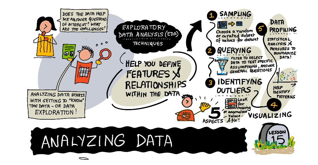
Exploratory Data Analysis (EDA) is the open-minded first look — summarizing, charting, and questioning data to understand what's there before drawing conclusions.
Key idea: EDA is about curiosity, not conclusions. You're getting to know the data — its shape, quirks, and surprises — the way you'd get to know a new city by wandering before planning a route.
Explain like I'm new: Before a doctor prescribes anything, they check your temperature, listen to your heart, and ask questions. They're exploring before deciding. EDA is that first check-up for your dataset: you look it over from several angles before you treat it as trustworthy.
During that first look you're trying to answer some very basic questions about the data itself: How big is it — how many rows and columns? What does each column mean, and what type is it? Where are the missing values? What's the typical value in each column, and what's the range? Are there obvious outliers or impossible entries, like an age of 200 or a negative price? None of these questions are the interesting question you set out to answer — but you can't trust any later conclusion until you've asked them. EDA is the unglamorous groundwork that keeps a flashy result from being built on sand.
2. A Simple Analysis Workflow
- Summarize — averages, counts, ranges (Module 5)
- Visualize — histograms and scatter plots (Modules 12–15)
- Segment — break data into groups and compare
- Question — chase anything surprising
- Note — write down what you find
Simple example: Analyzing app usage, you compute average session time (summarize), chart it (visualize), split by device (segment), notice tablets have oddly short sessions (question), and record it as a lead to investigate.
The segment step deserves extra attention, because it's where most real insight hides. An overall number blends everyone together and often looks unremarkable. The moment you split it — by region, by device, by age group, by signup month — the interesting differences jump out. A flat overall trend can conceal one group soaring while another sinks. So a reliable habit during analysis is: whenever a summary looks boring, break it into groups before you conclude there's nothing there. The story is frequently in the gaps between groups, not the average across them.
Real-world use case: A subscription service wants to understand cancellations. Summarizing shows the average customer stays 8 months — reassuring. But segmenting by signup source reveals customers from one ad campaign cancel within 2 months, dragging quietly on the numbers. That surprising split (question) becomes the whole story. Without segmenting, the average would have hidden it completely.
3. Stats + Visuals Together
Numbers and charts are stronger together. A statistic tells you how much; a chart tells you what it looks like. Use both — a suspicious average is confirmed (or debunked) by a quick plot. The famous "Anscombe's quartet" makes this vivid: four datasets can share the same average, spread, and trend line, yet look completely different when plotted — one is a clean line, another a curve, another has a single wild outlier. The number alone would never tell you which.
In practice this means your analysis should ping-pong between the two. Compute a statistic, then immediately plot it to see if the picture agrees. Spot something odd in a chart, then measure it so you can say how odd. Neither the number nor the picture is the "real" answer on its own — the confidence comes from the two agreeing. When a statistic and a visual disagree, that disagreement is itself a clue worth chasing, not an error to smooth over.
Common mistake: Jumping to conclusions from a single number. An average can hide a bimodal split, an outlier, or a missing group. Always pair a summary statistic with a visual before you trust it.
Data scientist tip: Keep an "analysis journal" — note each question, what you checked, and what you found. It keeps you honest, prevents re-doing work, and becomes the backbone of your final story (Module 20).
Key Takeaway: Analysis is exploratory data analysis — curious, open-minded investigation before conclusions. Follow a loop: summarize, visualize, segment, question, note. Always pair statistics with visuals (a number plus a chart), and journal your findings to stay honest and build toward your final story.
Further Learning
Adapted from Microsoft's Data Science for Beginners (MIT License). Sketchnote by Nitya Narasimhan.