"Do two things move together? Relationship charts reveal connections — the heart of finding patterns in data."
Learning Objectives
By the end of this module, you will be able to:
- Recognize when to show a relationship
- Read a scatter plot
- Use line charts for change over time
- Remember the correlation caveat
1. Connecting Two Variables
When you ask "does X relate to Y?" — hours studied vs. exam score, ad spend vs. sales — you're visualizing a relationship. This is where data science gets exciting, because relationships are the seeds of prediction: if study hours reliably track exam scores, you can start to estimate one from the other. Spotting which variables move together is the first step toward understanding why things happen and what might happen next.
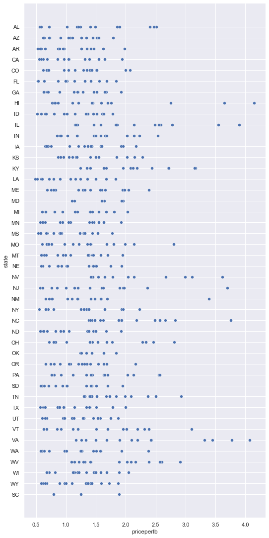
Key idea: A scatter plot puts one variable on each axis and a dot for each data point. If the dots drift up together, they're positively related; if they trend down, negatively; if they're a shapeless cloud, there's little relationship.
Explain like I'm new: Each dot on a scatter plot is one thing measured twice — for example, one student's study hours (across) and that same student's exam score (up). Plot every student and the dots form a shape. A tilt upward to the right means "more of this goes with more of that." The shape is the relationship.
2. Scatter Plots & Line Charts
- Scatter plot — best for spotting relationships and clusters between two numeric variables
- Line chart — best when one axis is time, showing how a value changes
Simple example: Plot each city's ice-cream sales against its temperature. The dots climb up to the right — warmer places sell more. The scatter plot makes the relationship visible instantly.
How do you tell them apart? Ask what's on the bottom axis. If it's time (days, months, years), use a line chart — connecting the dots shows the journey from past to present. If both axes are measurements with no time involved (temperature vs. sales, height vs. weight), use a scatter plot — you want to see the cloud of dots, not a connected path, because there's no order to walk along.
The tightness of the cloud tells you the strength of the relationship, connecting straight back to correlation (Module 5). Dots hugging a clear diagonal line mean a strong relationship (near +1 or -1); a loose, fuzzy smear means a weak one (near 0). So a scatter plot is really correlation made visible — you can practically see the number just by how neatly the dots line up.
Concept: A scatter plot can also reveal clusters — dots that bunch into separate groups. That's often a sign of hidden categories (say, two customer types behaving differently), and it's a discovery a single average would never show you.
Common mistake: Overplotting — cramming so many dots onto one scatter plot that they smear into a solid blob and the pattern disappears. With thousands of points, make the dots small and semi-transparent, or sample a subset. The goal is to see the shape of the cloud, and a solid black mass tells you nothing about where the data is dense or sparse.
3. The Big Caveat
Common mistake: Seeing a relationship and declaring cause. As in Module 5, correlation isn't causation — a scatter plot shows that two things move together, never why. It's a clue to investigate, not a verdict.
Picture the ice-cream-and-temperature plot again: it truly shows the two rise together, but the heat is what drives sales — the chart can't tell you that. A scatter plot is a brilliant question-generator ("why are these linked?") and a poor answer-machine. Treat every clear relationship as the start of an investigation, not the end.
Data scientist tip: Add color or size to a scatter plot to reveal a third variable (e.g., color dots by category). Suddenly hidden groups and patterns appear — one of the most powerful, underused tricks in data viz.
Real-world use case: An analyst plotted study hours against exam scores and saw a fuzzy upward trend. Coloring the dots by "took the prep course or not" split the cloud into two clean bands — the course-takers scored higher at every study level. The third variable, added with color, was the real insight.
Try this: Think of two things in your life you suspect are linked — steps walked and mood, screen time and sleep. Imagine the scatter plot: would the dots tilt up, tilt down, or scatter randomly? Then ask the crucial follow-up — what else could be driving both?
Key Takeaway: Relationship charts reveal whether variables move together. Scatter plots show the connection between two numeric variables (up = positive, down = negative, cloud = none); line charts show change over time. Use color/size to expose a third variable — and never mistake a visible relationship for proof of cause.
Further Learning
Adapted from Microsoft's Data Science for Beginners (MIT License). Chart from the source curriculum.