"Proportions answer: what share of the whole? What slice of the pie belongs to each part?"
Learning Objectives
By the end of this module, you will be able to:
- Recognize when you're showing proportions
- Use pie, donut, and stacked charts wisely
- Avoid the classic pie-chart mistakes
1. Parts of a Whole
When you want to show how a total splits into parts — market share, budget breakdown, survey answers — you're visualizing proportions. The key word is share: you're not asking "how much" in absolute terms (that's a quantity, Module 12), but "what fraction of the total does each piece take up?" Which you choose depends on whether the whole is the point.
Key idea: Proportion charts work best when the parts add up to a meaningful 100%. If your categories don't form a complete whole, a bar chart is usually clearer.
Explain like I'm new: The test for a proportion chart is simple: do your pieces add up to one complete thing? A budget divided into rent, food, and savings adds up to your whole paycheck — that's proportions. But "sales in five different cities" isn't parts of one whole (there are more cities out there), so a bar chart fits better.
2. Pie, Donut & Stacked Charts
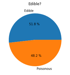
- Pie / donut — slices of a circle; fine for a few clearly different parts
- Stacked bar — parts stacked into one bar; better for comparing proportions across several groups
- Waffle — a grid of squares; easy to read exact percentages
Simple example: "How do I spend my day?" — sleep, work, meals, leisure — is a natural pie chart, since the slices add up to 24 hours (100% of a day).
The stacked bar deserves special mention because it solves a real problem: comparing proportions across several groups. Imagine showing how four departments each split their budget — four pie charts force your eye to jump back and forth, but four stacked bars side by side let you compare the same slice across all of them at a glance. When you have more than one whole to show, reach for stacked bars.
Concept: A donut chart is just a pie with the center punched out — the same strengths and the same weaknesses. The hole is handy for dropping in a total or a headline number ("100% = 24 hours"), but it doesn't make angles any easier to compare. Choose it for style, not for clearer reading.
A helpful mental rule: pies answer "what share is this one part?" reasonably well for a big, dominant slice, but answer "which part is bigger?" poorly — that's your cue to switch to bars.
Real-world use case: A survey asks "how satisfied are you?" across three regions. A single stacked bar per region — green for satisfied, grey for neutral, red for unhappy — lets a manager compare all three regions' satisfaction in one clean picture.
3. Common Mistakes
Common mistake: Cramming a pie chart with many similar-sized slices. Once you have more than ~5 slices, they blur together and comparison becomes guesswork. Use a bar chart instead — or group the small slices into "Other."
Also avoid 3D pies — the tilt distorts the slice sizes and misleads viewers. The reason both mistakes hurt is the same: pie charts ask your eye to compare angles and areas, which we judge poorly. Add a 3D tilt and the front slices look bigger than they are; add a dozen thin slices and no one can tell 8% from 11%. Every extra slice or fake dimension makes the honest comparison harder.
Real-world use case: A team presented market share as a colorful 12-slice pie. Everyone squinted, no one could rank the competitors, and the meeting stalled. Redrawn as a single sorted bar chart, the leader, challengers, and stragglers lined up instantly, and the discussion finally moved to strategy instead of decoding the chart.
Common mistake: Forgetting to add a percentage or value label. A slice that looks like "roughly a third" might be 28% or 36% — a meaningful difference the eye can't resolve from the angle alone. If the exact share matters (and it usually does), print the number on or beside each slice so readers aren't left guessing.
Data scientist tip: When in doubt between a pie and a bar chart, choose the bar chart. It's almost always easier to compare bar lengths than pie-slice angles. Save pies for a few big, obvious proportions.
Try this: Take your last week of screen time by app and sketch it as a pie. If you end up with eight tiny slivers, redraw it as a bar chart (or lump the small ones into "Other") and feel how much clearer it becomes — that instinct is worth more than any rule.
Key Takeaway: Proportion charts show parts of a whole (ideally adding to 100%). Pie/donut charts suit a few distinct parts; stacked bars compare proportions across groups; waffle charts show exact percentages. Avoid many-sliced or 3D pies — and when unsure, a bar chart is usually clearer.
Further Learning
Adapted from Microsoft's Data Science for Beginners (MIT License). Chart from the source curriculum.