"A chart can inform — or it can mislead. The same data can tell opposite stories depending on how you draw it."
Learning Objectives
By the end of this module, you will be able to:
- Spot misleading charts
- Make charts that are honest and clear
- Apply simple design principles
1. Charts Can Lie
Charts are persuasive — which makes dishonest ones dangerous. The same numbers can look dramatic or dull depending on axes, scale, and framing. Because our eyes read a picture faster than we read a table, a chart shapes what we believe before we've had time to check the underlying numbers. That speed is the whole point of a visualization — and also its risk.
Here's why this matters so much: hand someone a table of numbers and their brain slows down to check them one by one. Show them a bar three times taller than another, and they feel the difference instantly, rarely stopping to ask whether the axis is honest. A visualization borrows your reader's trust in exchange for that speed — and honest charting is about earning that trust rather than exploiting it.
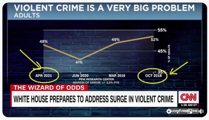
Key idea: Most misleading charts aren't outright lies — they're distortions: a truncated axis, a cherry-picked time range, or a 3D effect. Learning to spot them protects you (and your audience) from bad decisions.
Explain like I'm new: Imagine two photos of the same room. One is taken with a wide lens that makes it look huge; the other is cropped to look tiny. Neither photo added furniture — but each tells a different story. A distorted chart works the same way: same data, different framing, opposite impression.
2. Common Tricks to Watch For
| Trick | Effect |
|---|---|
| Truncated axis (not starting at 0) | Exaggerates small differences |
| Cherry-picked range | Hides the bigger trend |
| 3D / tilt | Distorts sizes |
| Inconsistent scales | Makes unfair comparisons |
| Too much clutter | Buries the message |
Each of these works by exploiting a shortcut in how we read pictures. A truncated axis abuses our habit of comparing bar heights; when the baseline isn't zero, a tiny real difference becomes a towering visual one. A cherry-picked range trims the timeline to whatever window supports the story — "look how it fell!" while hiding the years it rose. 3D and tilt distort area so a front pie slice looks bigger than an equal one at the back. And clutter simply drowns the one line the reader needed. The unsettling part is that every number can stay correct — the chart is what lies. This is why "the data is accurate" is never the same as "the chart is honest."
Real-world use case: A company reports quarterly sales of $101M, $102M, and $103M. On an axis starting at $100M, the bars look like they tripled — a dramatic jump. On an axis starting at $0, they look almost identical: growth is real but tiny. Same three numbers, wildly different message. The honest version starts at zero so the reader sees the true scale.
3. Principles for Honest Charts
- Start bar axes at zero
- Label clearly — titles, axes, units
- Show the full context — don't crop the story
- Keep it simple — remove decoration that doesn't inform
- Pick the right chart for the question (next module)
A quick way to remember these: a good chart is like a good news headline — accurate, in context, and easy to read at a glance. If you had to explain what the chart "really" means after showing it, the chart itself did not do its job.
One nuance is worth knowing: the "start at zero" rule is strongest for bar charts, because a bar's height is the message, so cutting the axis rewrites it. For line charts tracking change over time, a zero baseline isn't always required — the reader follows a slope, not a height — so a zoomed-in line can be honest as long as the axis is clearly labeled.
Common mistake: Adding chart junk — heavy gridlines, gradients, 3D, clip art. Every non-data element competes with your message. When in doubt, remove it. Clarity beats decoration.
Try this: Take any chart you've made and delete one thing at a time — a gridline, a background color, a bold border. Keep deleting until removing anything more would lose meaning. Most charts survive a surprising amount of stripping, and read more clearly for it.
Data scientist tip: Before sharing a chart, ask a colleague "what does this tell you?" — without explaining it. If they read a different story than you intended, redesign it. A chart should speak for itself.
Key Takeaway: Charts persuade, so honesty matters. Misleading charts usually distort (truncated axes, cherry-picked ranges, 3D, clutter) rather than lie outright. Make honest visuals: start bar axes at zero, label clearly, show full context, cut decoration, and pick the right chart — then test that it tells the intended story on its own. Treat your reader's trust as something you can lose with a single sneaky axis.
Further Learning
- Meaningful visualizations — Microsoft Learn Data Science
- Data visualization principles — web.dev / Google
Adapted from Microsoft's Data Science for Beginners (MIT License). Chart from the source curriculum.