"A distribution answers: how are the values spread out? Are they clustered, even, or full of surprises?"
Learning Objectives
By the end of this module, you will be able to:
- Understand what a distribution shows
- Read a histogram and density plot
- See why distributions matter
1. How Are Values Spread?
A distribution shows how often each value (or range of values) appears. It reveals shape: where data clusters, how wide it spreads, and whether there are outliers. Where a single average squeezes a whole dataset into one number, a distribution keeps the full picture — you see not just the "typical" value but how common every other value is around it.
Key idea: Two datasets can share the same average yet have totally different distributions (Module 5). The distribution shows the whole story the average hides.
Explain like I'm new: A distribution is just a chart that answers "how common is each value?" Tall spots mean "lots of values around here," short spots mean "rare." Reading a distribution is like reading a crowd from above — you instantly see where people bunch up and where the room is empty.
2. Histograms & Density Plots
- Histogram — bars showing how many values fall into each range ("bin"). Great for seeing shape.
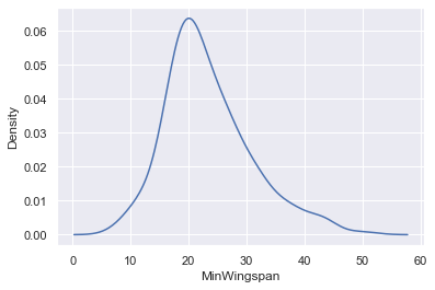
- Density plot — a smooth curve version of a histogram.
The bell shape (normal distribution) is common, but data can also be skewed (a long tail on one side) or have two peaks. Those shapes are clues. A long right tail (like incomes) warns you the average is being pulled up by a few big values. Two peaks is especially telling — it often means two different groups are hiding in one dataset, like combining the heights of adults and children into a single chart.
Concept: In a histogram, the bin width matters. Too few, wide bins hide the shape; too many, narrow bins make it look jagged and random. Try a couple of bin sizes — the right one reveals the shape without the noise.
A quick vocabulary that pays off: a distribution with a long tail stretching to the right is right-skewed — incomes and house prices are classic examples. A tail stretching left is left-skewed, and when the two halves mirror each other it's symmetric (the bell curve). Naming the shape — "this is right-skewed" — already tells you the mean will sit higher than the median.
Common mistake: Reporting only an average for skewed data. If house prices are right-skewed, the "average price" sits above what most homes actually cost, quietly overstating the typical value. The distribution's shape is your warning sign to reach for the median instead.
Simple example: A histogram of exam scores might show most students around 70–80, a few high-flyers near 100, and a small cluster who struggled near 40. One chart, the whole class at a glance.
3. Why Distributions Matter
Before analyzing, data scientists always look at distributions. They reveal outliers, skew, and data-quality problems (Module 11) that would silently distort any average or model. Think of a distribution as a health check-up for a column of data: in one glance it shows whether values are bunched sensibly, whether a strange spike or gap is hiding, and whether the shape matches expectations.
Explain like I'm new: A histogram is built in two simple steps. First, chop the range of values into equal slices called bins (say, ages 0–10, 10–20, 20–30…). Then, for each bin, draw a bar as tall as the count of values that land in it. Tall bar, lots of values there; short bar, few. That's all a histogram is — a tally turned into bars.
Real-world use case: A team reported an "average response time of 2 seconds" and thought all was well. Plotting the distribution revealed a second bump far to the right: a chunk of users waited 10+ seconds. The average had hidden a real problem that only the shape exposed — and fixing it improved the experience for those users.
Concept: A vivid demonstration of why shape beats the average: take ten test scores all near 70 (68, 69, 70, 71, 72…), then ten more that average 70 but swing wildly (40, 45, 95, 100…). Both share the exact same mean, yet their histograms look nothing alike — one a tight peak, the other split and scattered. The average hid the difference; the distribution revealed it.
Data scientist tip: Make a histogram of every important column before you model. It takes seconds and instantly flags weird gaps, spikes, and outliers — problems invisible in a table.
Try this: Collect a simple set of numbers — everyone's age in your family, or song lengths in a playlist — and sketch a rough histogram by tallying values into ranges. Notice whether the shape is a bell, a lopsided tail, or two separate humps.
Key Takeaway: A distribution shows how values are spread — clustered, even, skewed, or with outliers — telling the story that an average hides. Read them with histograms (binned bars) and density plots (smooth curves). Always inspect distributions before analyzing to catch skew, outliers, and quality issues early.
Further Learning
Adapted from Microsoft's Data Science for Beginners (MIT License). Chart from the source curriculum.