"A good chart shows in one glance what a table of numbers hides. Visualizing quantities is about comparing 'how much' or 'how many.'"
Learning Objectives
By the end of this module, you will be able to:
- Choose charts that compare amounts
- Read and build a bar chart
- Avoid a common quantity-chart mistake
1. Comparing Amounts
When your question is "how much" or "how many," you're visualizing quantities — and the workhorse is the bar chart.
Key idea: Bars are great because our eyes compare lengths very accurately. The longest bar instantly reads as "the most" — no squinting at numbers required.
Explain like I'm new: Your brain is surprisingly bad at comparing raw numbers (is 4,812 much bigger than 4,377?) but excellent at comparing lengths. A bar chart turns the numbers into lengths, handing the comparison to the part of your brain that's fastest at it. That's the whole trick behind why charts work.
Concept: "Quantities" simply means counts and amounts — how many birds, how much revenue, how many votes. Whenever your answer is a number attached to a category, you're in quantity territory, and a bar chart is almost always the safe first choice.
2. Bar Charts
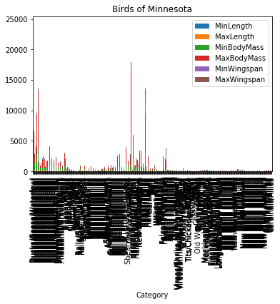
Bar charts compare a value across categories — sales per region, birds per species, votes per candidate. Keep them clean: clear labels, sorted bars, and a sensible starting point. Each category becomes one bar whose length stands in for the amount, so our length-savvy eyes can rank a dozen categories almost instantly, spotting the tallest and shortest without reading a single number.
Simple example: To compare coffee sales across five shops, a bar chart makes the leader and the laggard obvious in a second — far faster than reading five numbers. One axis lists the categories, the other measures the amount, and each bar rises to its value — read across to find a category, up to see how much.
Two small habits make a bar chart much stronger. First, sort the bars by size (unless the categories have a natural order like months) — a sorted chart lets the ranking pop out instantly. Second, label directly and remove clutter — no heavy gridlines or decoration competing with the data. The goal is that a viewer understands it in one glance, without studying it.
Real-world use case: A store manager wants to know which of eight products to restock first. A sorted bar chart of units sold puts the top seller at the top and the slow movers at the bottom — the restocking priority list draws itself, and the manager decides in seconds without opening a single spreadsheet.
A close cousin, the grouped bar chart, places several bars side by side within each category — this year's and last year's sales per region — for comparing two or three things at once.
Data scientist tip: If your categories have long names (countries, product titles), turn the bars horizontal. The labels sit neatly to the left and stay readable, instead of being squished or tilted under vertical bars.
3. When Amounts Change Over Time
For quantities over time, a line chart often reads better than many bars — it shows the trend as a shape (we cover relationships and time in Module 15). A row of 30 daily bars is hard to read as a trend, but a single line rising and dipping across those 30 days tells the story of "up, then down, then recovering" at a glance.
Common mistake: Starting a bar chart's axis at a number other than zero. It exaggerates small differences and misleads viewers — a tiny gap can look huge. For bar charts, always start at zero.
Here's why zero matters so much: because we read bars by length, a bar chart that starts at, say, 90 instead of 0 makes a value of 100 look ten times taller than a value of 91 — even though they're nearly the same. The chart lies without saying a false word. Anchoring at zero keeps the lengths honest.
Real-world use case: A company's quarterly revenue rose from $2.00M to $2.05M — a tiny 2.5% bump. Shown on a bar chart starting at $1.95M, the second bar towered over the first, making a flat quarter look like explosive growth. The same data with an axis anchored at zero showed two nearly equal bars — the honest picture. Same numbers, opposite impressions, decided entirely by where the axis began.
One more habit: label the actual values when precision matters, printing the number at the end of each bar so readers get both the instant ranking and the exact figure.
Try this: Grab any five numbers from your life (hours slept each night this week) and sketch them as bars. Notice how the pattern jumps out visually in a way the raw numbers didn't.
Key Takeaway: To compare how much or how many, use bar charts — our eyes judge bar lengths accurately, so the biggest and smallest pop out instantly. Keep them clean and sorted, use line charts for quantities over time, and always start bar axes at zero to avoid misleading viewers.
Further Learning
Adapted from Microsoft's Data Science for Beginners (MIT License). Chart from the source curriculum.