"Accessibility isn't an extra. It's building the web so everyone — including people using keyboards, screen readers, or low vision — can use what you make."
Learning Objectives
By the end of this module, you will be able to:
- Explain why accessibility (a11y) matters
- Use semantic markup and alt text well
- Build keyboard-friendly, readable pages
- Check color contrast
1. Why Accessibility Matters
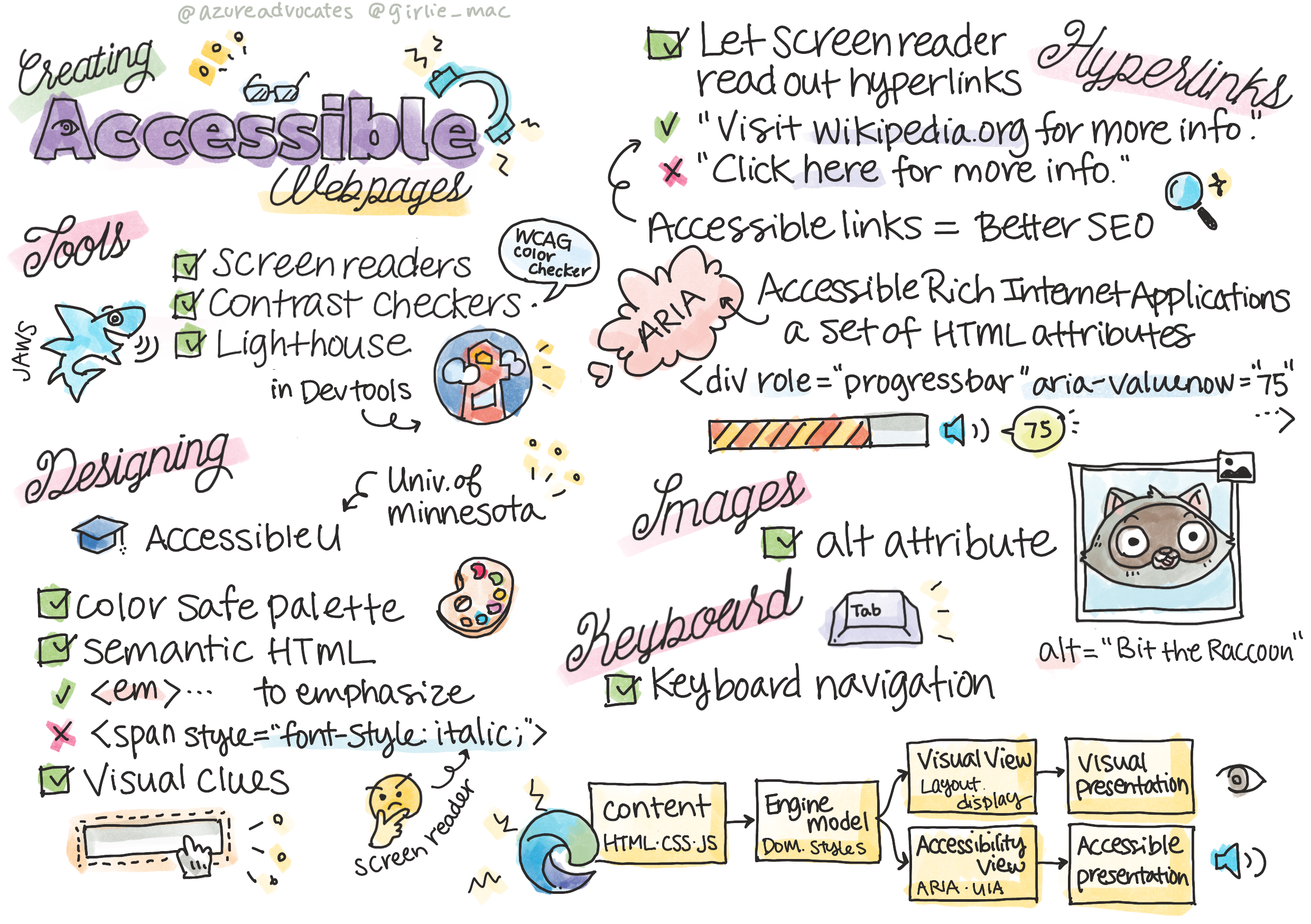
Accessibility (often shortened to a11y) means making sure people with disabilities can use your site. Around 1 in 6 people worldwide live with a significant disability — and accessible sites are also clearer, faster, and rank better in search.
The shorthand "a11y" simply keeps the "a" and the "y" of accessibility with the 11 letters between them counted in the middle (the same trick gives us "i18n" for internationalization). It's worth remembering that disability isn't always permanent, either: a broken arm, bright sunlight, or a noisy train all create temporary barriers that accessible design quietly removes.
Key idea: Accessibility helps everyone. Captions help in noisy rooms, good contrast helps in sunlight, keyboard support helps power users. Build it in from the start — it's far harder to bolt on later.
Real-world use case: Captioned videos help deaf users — and also anyone watching on mute in a library or on a crowded bus. This "curb-cut effect" (named after sidewalk ramps that help wheelchairs and strollers, luggage, and delivery carts) shows up constantly: accessible design helps far more people than you first expect.
2. Semantic Markup & Alt Text
Two habits do most of the work:
- Semantic HTML (Module 5) — screen readers rely on tags like
<nav>,<main>, and<button>to describe the page. - Alt text — every meaningful image needs an
altdescribing it:<img src="cat.jpg" alt="A ginger cat asleep on a keyboard">.
Screen readers — software that reads pages aloud for blind and low-vision users — build their entire understanding of a page from your tags. For example, these two look identical on screen but behave completely differently:
[object Object],Send,[object Object],      ,[object Object],
,[object Object],Send,[object Object], ,[object Object],
The <button> version is focusable, announced as a button, and responds to Enter — all for free. Headings (<h1>–<h6>) matter just as much: screen-reader users often jump from heading to heading to skim a page, so a logical heading order acts like a table of contents for them.
Beginner mistake: Writing alt="" on meaningful images or stuffing keywords into it. Describe what the image shows and means. (Purely decorative images are the one case where empty alt="" is correct — it tells screen readers to skip them.)
3. Keyboard-Friendly & Readable
- Keyboard: Everything clickable should work with Tab and Enter — use real
<button>and<a>elements, not clickable<div>s. - Readable: Clear fonts, generous sizes, short lines, plenty of spacing.
Many people never touch a mouse — including keyboard power users and people with motor disabilities who navigate entirely with Tab, Enter, and the arrow keys. When you build with real interactive elements, keyboard support comes for free; fake buttons made from <div>s silently break it. The visible focus outline — that ring around the active element — is part of this too, so don't remove it without providing a clear replacement.
4. Color Contrast
Text must stand out from its background. Guidelines (WCAG) recommend a contrast ratio of at least 4.5:1 for normal text. Your browser's DevTools can check this for you.
Contrast is why light-grey text on a white background can look "stylish" to a designer yet be nearly invisible to someone with low vision or on a sun-washed phone screen. When you inspect a text element, DevTools shows its contrast ratio — and even a checkmark when it passes — so there's no math for you to do. A related rule: never rely on color alone to carry meaning — a red "error" and a green "success" can look identical to someone with color blindness, so pair color with text or an icon.
Practice task: Open a page you built and try to use it with only your keyboard — no mouse. Can you Tab to every link and button and activate them with Enter? Anything unreachable is an accessibility gap to fix.
Key Takeaway: Accessibility (a11y) makes the web usable for everyone and improves quality for all. The essentials: semantic HTML, meaningful alt text, full keyboard support, readable typography, and sufficient color contrast (aim for 4.5:1). Build it in from the start.
Further Learning
Adapted from Microsoft's Web Dev for Beginners (MIT License). Sketchnote by Tomomi Imura.