"If HTML is the skeleton, CSS is the skin, clothes, and style. It's how a plain page becomes something people enjoy looking at."
Learning Objectives
By the end of this module, you will be able to:
- Write CSS rules with selectors
- Understand the box model
- Lay out pages with Flexbox and Grid
- Make a page responsive
1. How CSS Works
CSS (Cascading Style Sheets) styles your HTML. A rule picks an element (the selector) and sets properties:
[object Object], {
  ,[object Object],: teal;
  ,[object Object],: ,[object Object],;
}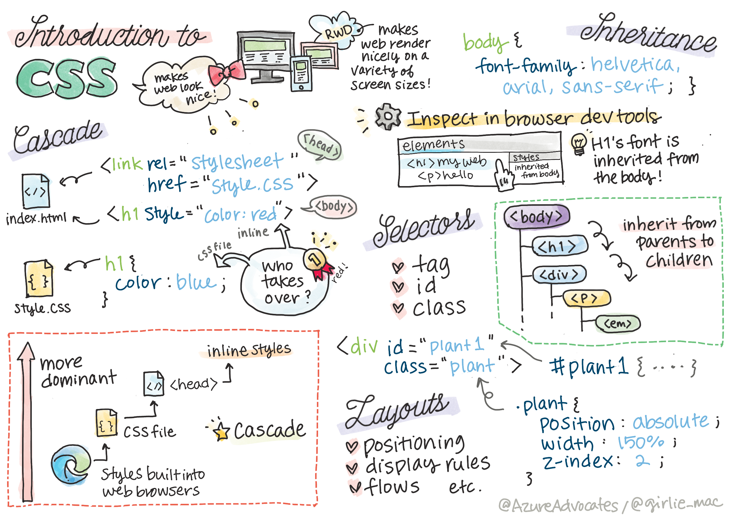
Key idea: Every CSS rule answers two questions: what to style (the selector — a tag, a .class, or an #id) and how to style it (the properties). Master selectors and half of CSS clicks into place.
You connect a CSS file to your HTML with one line in the <head>:
[object Object],Selectors come in three everyday flavors: a tag selector like p styles every paragraph; a class selector like .warning styles anything you mark with class="warning"; and an id selector like #header targets one unique element. Classes are the workhorses — reusable and flexible — so you'll write far more .class rules than anything else.
Concept: The "Cascading" in CSS means rules flow and can override each other. When two rules touch the same element, the more specific one wins, and if they're equally specific, the one written later wins. This is why order matters in your stylesheet.
2. The Box Model
Every element is a box with four layers, from inside out:
| Layer | What it is |
|---|---|
| Content | The text or image itself |
| Padding | Space inside the box, around the content |
| Border | The edge of the box |
| Margin | Space outside the box, between it and others |
Picture a framed photo on a wall: the content is the photo, the padding is the mat between photo and frame, the border is the frame itself, and the margin is the empty wall space keeping it away from the next frame. A quick example:
[object Object], {
  ,[object Object],: ,[object Object],;        ,[object Object],
  ,[object Object],: ,[object Object], solid ,[object Object],;
  ,[object Object],: ,[object Object],;         ,[object Object],
}
Beginner mistake: Mixing up padding and margin. Padding pushes content away from the box's edge (inside); margin pushes other elements away (outside). When spacing looks wrong, check which one you're using.
3. Layout: Flexbox & Grid
Modern CSS makes layout far easier than it used to be:
- Flexbox — arranges items in a row or column (great for navbars, button groups)
- Grid — arranges items in rows and columns (great for page layouts, galleries)
You'll reach for Flexbox constantly and Grid for bigger structures.
A common rule of thumb: if you're laying things out in one line (a row of nav links, a strip of buttons), reach for Flexbox. If you need both rows and columns at once (a photo gallery, a dashboard), reach for Grid. They also work together — a Grid cell can happily contain a Flexbox row.
Try this: Add display: flex; to a <div> that holds three buttons and watch them line up side by side instead of stacking. Then add gap: 1rem; to space them out. Two lines, instant layout.
4. Responsive Design
Responsive design means your page looks good on phones, tablets, and desktops. The main tool is the media query, which applies styles only at certain screen sizes:
[object Object], (,[object Object],: ,[object Object],) {
  ,[object Object], { ,[object Object],: none; }
}
The idea is simple: write your normal styles, then use a media query to change a few of them once the screen crosses a certain width (a "breakpoint"). In the example above, the sidebar simply disappears on narrow phone screens where there's no room for it.
Real-world use case: Open any big site (like Wikipedia) on your phone and on a laptop. The menu might become a hamburger icon, columns collapse to one, and text resizes — all driven by media queries reacting to your screen width. One codebase, every device.
Practice task: Take the plain HTML page from Module 5 and add CSS: a background color, a readable font, some padding, and center the content. Then shrink your browser window and watch how it behaves — your first taste of responsive design.
Key Takeaway: CSS styles HTML using selectors (what) and properties (how). Every element is a box (content, padding, border, margin — don't confuse padding with margin). Use Flexbox for rows/columns and Grid for full layouts, and media queries to stay responsive across screen sizes.
Further Learning
Adapted from Microsoft's Web Dev for Beginners (MIT License). Sketchnote by Tomomi Imura.